Best place to start the blog is probably the start of university, and my first year work. This is just going to be an overview as the first year was me getting to know the software and process of designs and being more creative with my work. Before university I hadn’t done a design course at high school or college but did start an online interior design course in my year out of education so I had some drawings but nothing spectacular just yet. I was unsure at first if my lack of experience would be a problem at university but we started at the basics and worked our way through, began with sketches and moved on to sketch up and CAD, unfortunately no Photoshop in this year though.
The first few projects were group projects and really basic skills so I’ll actually start with our 3rd project and possibly my favourite project of the year. Designer Inspiration was the title of the brief and it involved a lot of research and lot of design development. We had six designers we had to research and pick one to base the project on. The six were Herzog and de Meuron, Ross Lovegrove, Santiago Calatrava, Ron Arad, Thomas Heatherwick and Zaha Hadid, I decided on Zaha Hadid because her designs are contemporary and intense, opposite to what I would have described my designs as at the time. An aspect of her designs I was a huge fan of though is the use of shadows and light and the fluid patterns she created. So for my design I wanted to focus on the use of light in design and a sense of fluidity so I designed a building with a curved outer shell and more square inner structure with lots of angular windows and angled support beams to create shadows inside that would change as the day went on. I worked on my initial design and came up with a final design and made a model, at this stage we hadn’t started with sketch up and CAD. The model was the best way of showing the patterns created by the multiple windows and support beams.


The Enclosure project was my first project using CAD and Sketch Up. It required a lot of design development and consideration of materials and the site I was using. The enclosure I was designing was a meeting/work room in the Interior Design Studio at university which was very white and exposed block walls with metal beams and pipes on show, a very cold and industrial room. This meant that for my enclosure I wanted to use exposed raw materials but I wanted to use a softer and warmer material so I went with wood and glass for the wall of the enclosure. I needed the structure to be adjustable so I put the wall in a track on the floor so it could be opened slightly if more room was needed. I wanted the space inside to be a bit more private so the wood panels were thick enough so at different points in the studio you couldn’t see into the area but the glass in between the panels meant it was still bright enough inside. The studio was a very large space and was very loud so I incorporated sound proofing into my design which made the space inside have a lower ceiling making it feel more private and added some colour and interest as well as being very practical. I added more storage to the studio and enclosure and used the colour green in the space to differentiate the spaces. I made CAD plans and elevations along with a laser cut model and a sketch up visual to show how I wanted the space to look. This project required a lot of site and material consideration as well as being creative along side working on presentation skills and what is needed to show off my design.


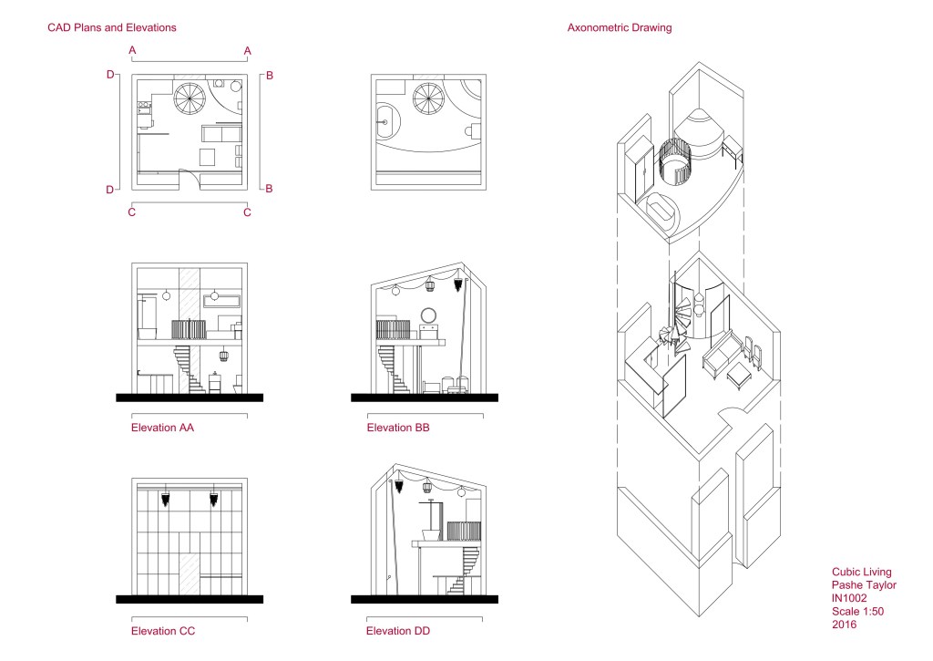
The final project of the year was Cubic Living and it was a big one and needed all the skills I had learned as well as sourcing materials for a sample board and creating axonometric drawings. It was a much more complex project but because of it being a made up client with no budget it was a chance to be as creative as possible in a small cubic space. The spatial planning was key for this project and not overwhelming the space with the interior design. I took a lot of time to figure out the layout of the site and I decided on a mezzanine level for the upper floor to let enough light into the lower floor. My design was based on old Hollywood and theatres so I used a lot of velvets and mixed metals to create an opulent feel but kept the basic walls, floors and permanent features fairly neutral. I designed a spiral staircase in the space which was difficult to create on the axonometric drawings and make for the model. I ensured the space could be as adaptable as possible with curtains separating areas that could be moved to be more open or create privacy and lots of lighting, because this was a square box on a row of buildings. Storage was also an issue so I put in a wall of antique glass covered cupboards on a whole wall, this helped with the main issue of storage but also lighting and creating an illusion of more space and a real feature for the whole interior. I was really pleased with the outcome of this project and thought I completed good Sketch Up visuals and CAD drawings, it was a great way to end first year and get us ready for second year.


I didn’t include some projects because some were group work and others didn’t include as much technical work but my favourite ones and the most challenging projects I did include. First year was fun and creative but second year got a lot more technical, a post on my second year is coming soon as well my trips from first and second year and then my final year work can begin. First blog post, done.

Leave a comment