
My second year at university was definitely more technical and challenging than first year. As well as focusing on the more technical aspects of interior design, it was a chance to be more independent and work on my time management and motivation. This will be a fairly brief overview of my second year with a bit more focus on my last project as it was a long process using everything I had learnt over the past two years. During second year I also did Digital Workshops which I will cover in another post because there is a lot of examples from that course.
My first project of the year was based around a designer we chose, and I chose Shigeru Ban who is an architect, then we had to design a cabinet inspired by the designer. It was similar to the Designer Inspiration project I had done in first year so was a good way to start the year. It was also the first project using photoshop and we had to make a model for it so it set us up of the year well. I created a cabinet that was curved and flowed like a lot of his designs and concentrated particularly on the materials, as it is something that is innovative with his work. The final outcome was okay and I was pleased with it, it also gave me a something to improve upon though.

The next project was a Subliminal Retail Installation. It was a good way to start thinking a bit more about the presentation of my work. I enjoyed the project because it was still quite creative and had to be thought about a lot to create something that was easily recognisable but not plastered with a brands logo. The brand I chose was Cartier as it has a few elements of branding which is easily recognisable and works towards a particular market. I initially thought of the key features in their advertising, being the Cartier Panther and the red box with gold trim. Cartier is well known for delicate but long lasting jewellery so I didn’t want something that looked cheap and tacky but it needed to be elegant looking. I decided to focus on the Cartier Panther which proved tricky when I started to create it in CAD. I wanted it to be made of a thin gold coloured steel wire so it was sturdy and looked similar to jewellery. I used a crimped jewellery wire to make the model and added loops into the wire to create the spots and to place rubies, emeralds and diamonds. I also wanted it to light up so it could still be seen at night and also because I would place the installation in Paris as it is a French company and it would be similar to how the Eiffel tower twinkles with lights at night. I was really pleased with the model and work but I wasn’t happy with my final visual. I realised what I needed to work on though for my next project.


One of the biggest and most challenging projects of second year was the Stairs Project. For it we had to design stairs for the Student Union Atrium space at UCLan as the current stairs are hard to find and theres a lot of empty space in the building. It was a tricky project as there are a lot of regulations to meet and safety is key with these being large stairs in quite a crowded area. I started off with thinking about the initial design and I didn’t want something that was to round or spiralling as even though they look good they aren’t the most practical in this area. I had to work out how many stairs I could fit into the space meeting the required going and rise for each step. Also taking into consideration the handrails which have to be a certain height and width apart. It was definitely tricky, particularly when it came to putting it into CAD, I had designed mine to have the bottom section of stairs to be coming out at a different angle which was challenging to do as an Axonometric drawing. To make it harder we were also presenting this on an A2 piece of paper so we had to make sure the most important parts stood out and the writing wasn’t too prominent. Overall I was happy with my work for this project and proud that my CAD drawings looked good.
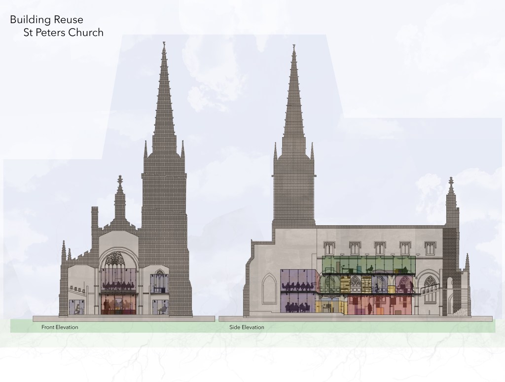
The final project of second year was the project with the most work involved and is my best work to date, I think. The site for this project was St Peters Church which is on campus and is currently used for performing arts students. The brief was to redesign the church into a library/study zone with a gallery space and meeting rooms for design students. I decided to focus on parts of the church’s design that could potentially incorporate into my final design as I wanted it to match the church and not look too modern inside. Th stained glass windows is what I thought could be used well in my design but I didn’t want something too distracting as this was a study pace. I used just block colours that were the same found in the windows and placed these coloured glass paned within a black steel frame to mimic the lead outlining. I created different zones and pods with the main ground floor level space being a gallery area as it will have the most traffic. I included big meeting rooms and smaller work rooms big enough for one person so I could utilise as much of the space as possible and cater for all. I focused mainly on the photoshop part of the presentation as we had to use an A1 board for our final design. I put my design on to CAD first then I exported it to Photoshop to add the colour, people and the key to show the different areas. I was so proud of this project and think it turned out really good considering I also went to Singapore with uni during this project. I just wish I had done a final model for this project but I wanted my board to show the design well enough to not need one and I think I achieved that.

Second year was a lot harder than first year and required more independent study but the challenge prepared me better for 3rd year. I enjoyed the more technical side of this year and focus on materials. I was happy with the progress I made this year and was pleased with how I presented my work and could cary it through to 3rd year.

Leave a comment