
To create a successful interior space, careful space planning needs to happen. Sometimes even carefully thought out floor plans can be improved or can still have dead zones. I have been looking at different places with varied uses to explore spatial planning, dead zones and touch spots. I also considered how they could be improved or adapted in some way to improve the flow of traffic.
To start off and get a sense of the task I had been set, I decided to look at my house. I know this is a domestic space however it is a space I know very well and did use to be a doctors surgery and does have potential to be a commercial space or some kind of residential home. The part of the ground floor with the heaviest flow of traffic is the entryway. This space has many touch points, with a place for coats and a cabinet to put bags, letters etc. on. From this area there are a few directions to go in, he most popular is straight through to the kitchen. This could be because its the direction you are already going in, or because it leads onto the garden which you can see from the front door. Perhaps this view encourages people into the space but it is the most used area for residents and guests. This flow of traffic creates two dead zones straight away in the house. These are the first sitting room and dining room. This has meant the front of the house is barely used but if it was used for a commercial purpose all it would take would be to create bigger doorways or take the wall out almost completely to open up this space and keep the guests in this area. If it was turned into a residential home the current layout ends itself to having two front bedrooms as they aren’t rooms that people gravitate too or stop to look into. 
From here I went on to look at the Spar shop in Coppull. Again this is somewhere I have been to many times and seen how a change of layout really helped the shop. The first picture shows the original layout of the counter and how the people using the shop are mainly coming in to use this counter and go straight to it with nothing in their way or anything to help form a queue. This meant that less people were looking at more of the shop and therefore creating many dead spots at the back of the shop. A possibility would have been to move the counter to the back of the shop so a customer would have to walk past more products and buy more items, however I think this would have caused more problems and more wasted space as products cant be too close to the door because of theirs and the practicality of people opening the door and people in wheelchairs using the shop.As well as having to get rid of lots of shelves and fridges so the counter would fit. I think they came up with a simple yet better layout by simply turning the counter to be against the wall with the door on as it forces customer to walk further into the shop to join the queue. They also added a stand to hold seasonal and sale items, this created a touch point as people would often pick these up to see what they are and often buy them or tell others abut them. It also created a place for people to queue, on either side or around it meaning if people wanted to join the queue or get around these people they would have to go down aisles, even if thats what they’d come for they would perhaps go down different aisles. There is still some less used zones in the shop but I think they definitely improved the sales through this change of till layout and creating a touch zone.


I then went on to assess the floor plan at my work, which is dessert cafe bar that has a counter just for ice cream at the front of the shop. I did two drawings for this site as the flow of traffic and use of the site changes with the seasons. I started with summer and this is when it is mainly the front of the shop that is used and when our amount of traffic is highest. In the summer months, the back of the shop is barely used and it is just the front that has a steady flow through with customers in one side and out the other. I would consider the ice cream counter a touch point as this is where everyone goes to and there is something to look at, I found that even if customers weren’t getting any ice cream they would still look. In summer there is a dead zone at the back of the shop with usually only customers using the toilets and staff going to the store room that it is used. Whereas in the winter months, more of the shop is utilised and it is the side counter that is used more often which actually causes congestion and stops a flow of traffic to the back of the shop. Again in winter this causes a dead zone, another reason for this is because the counter hides the bad corner from view so customers either don’t know its there or dont want to walk past all the other tables and the queue to see if it is empty. The drinks fridge and confectionary stand is at the front of the shop so we have definitely found a drop in these sales comes winter as less people congregate near the front of the shop with the door being there. I think to prevent this dead zone at the back of the shop and for us to fit as many customers in as possible, preventing as much congestion in the shop as possible, it would make sense to move the counter down so it starts against the back wall. It would have to stay against the wall it is on currently for staff access points but it would create more space at the front and use the dead zone effectively. This layout may also cause some problems and perhaps not fit as many people in but it would prevent the back log of customers.


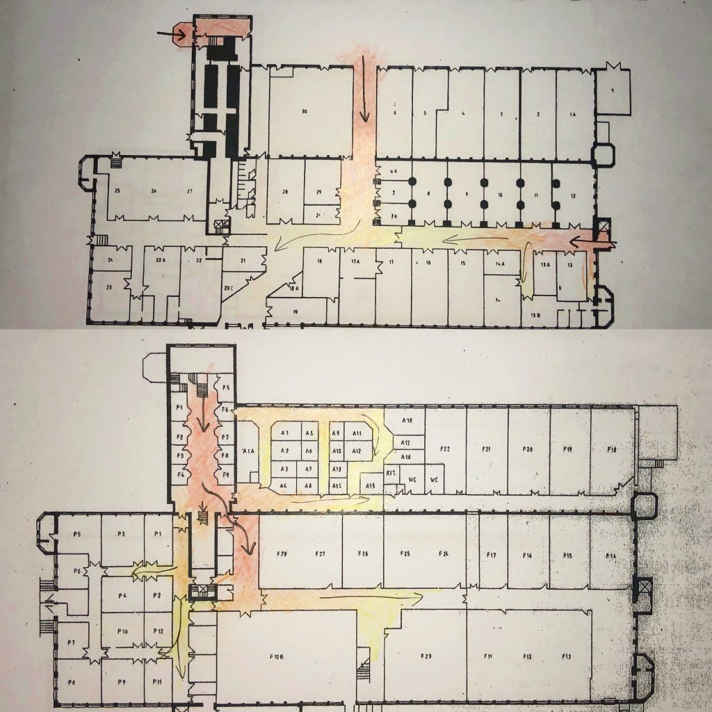
I decided to do a different type of site, one that was more of a transition space and it is also my honours site. It is much less used and a lot bigger than the previous space planning buildings I looked at. There are a few floors and a lot of dead spaces which is why I originally chose it for my honours project. Starting with the ground floor, the most used area of the whole building is definitely the reception as it is the main entry point and the only place with someone constantly there. This zone has a lot of touch points, with pictures, leaflets and information, a spot where pope tend to linger. There are other entry points for the work units on site which have quite a heavy flow of traffic but it is just for the businesses so the amount of people in these areas isn’t high. the stairs to the next floor are located near reception and this is almost solely a transition space even though there are a couple of shops here. No one really stopped in this space but it is a space you have to go through to get to the other offices and businesses in the building. There are a significant amount of dead zones on this floor as not all the office rooms are full and the ones that are used are all together. I would say only a few people in a week go to these rooms further out as I didn’t pass anyone when i walked around them. There is then stairs in the main area of the first floor that lead to the second floor which is predominantly an open space for the two businesses there. Again I didn’t see anyone arrive or leave this space on the few occasions i have been to the site so there doesn’t appear to be many people who use that space or any that use the space on the floor beneath them. The third floor, which is the final floor not including the tower, isn’t used at all and ant be accessed by the public so is a complete dead zone like much of the building. I think the area on the first floor could be utilised better with touch points and more objects of interest to keep people in this area snd they then might use the shops here or explore ore of tis building which is really nice and grade II listed so is currently being wasted in my opinion. Another possibility would be to create some sort of service in the top floor such as a restaurant or some kind of exhibition space so there would be more traffic through the space at varied times. I will look further into this site as my honours project continues but this was a great start and help to assess what the space needed.


Looking at space planning is key to interior design and can be the difference between a very successful business or empty unused building. This has really helped with my ongoing projects and is something I will explore further with buildings that have different uses to see what works best.

Leave a comment